Salt Lake City Marathon
Refreshed Brand Color Palette
ROLE
Creative Direction / Brand Identity
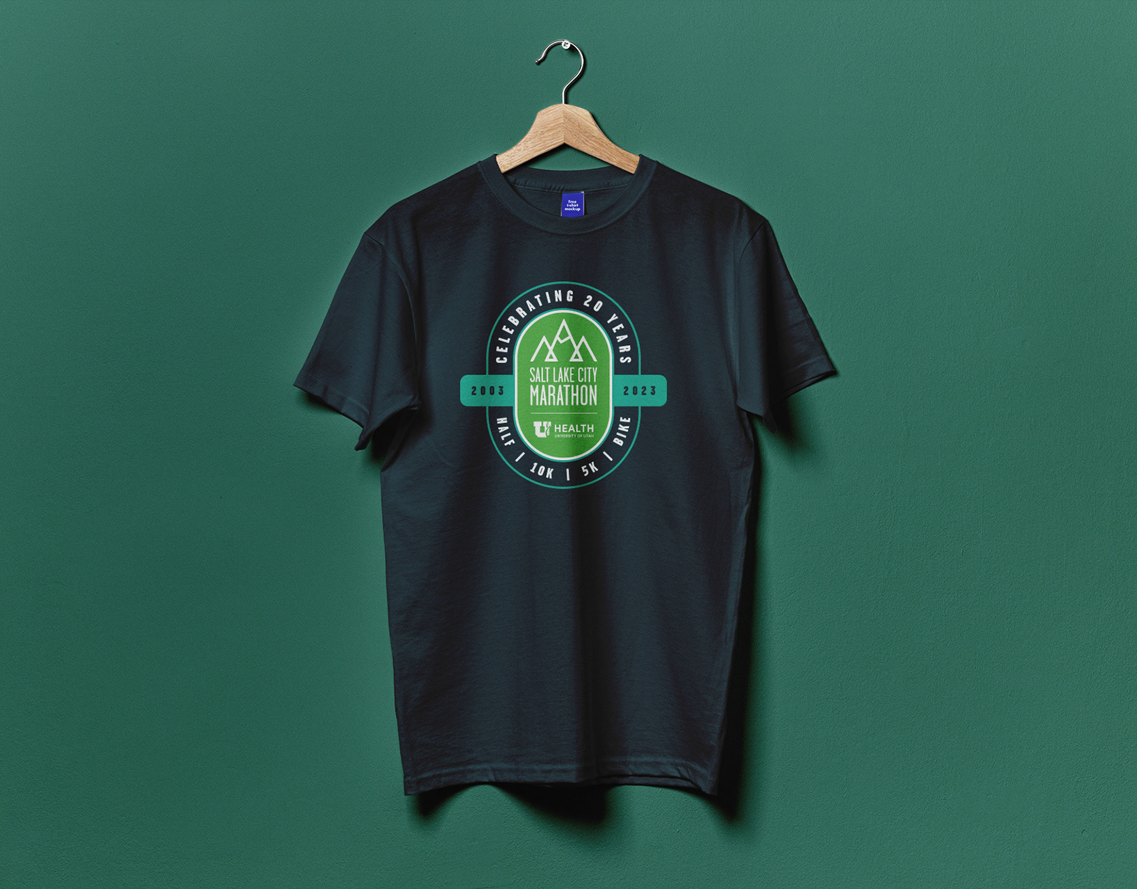
2023 marks the 20th Anniversary of the Salt Lake City Marathon. In honor of this milestone, I was approached to provide creative direction on refreshing the color palette for the race brand. The team wanted new colors that were, "Fresh, Modern, and Fun." The colors needed to cater to women, the largest demographic of race attendees, without alienating the rest of the field.
The process began by researching competitor races to assess the market and best determine how the SLC Marathon could differentiate. By drawing inspiration directly from the flora, landscapes, and iconic landmarks around the city, this color palette showcases the uniqueness and beauty exclusive to the Salt Lake City Marathon. Celebrating the city and differentiating from competitor races resulted in a fun, fresh, and modern update to the look and feel of the event and brand.
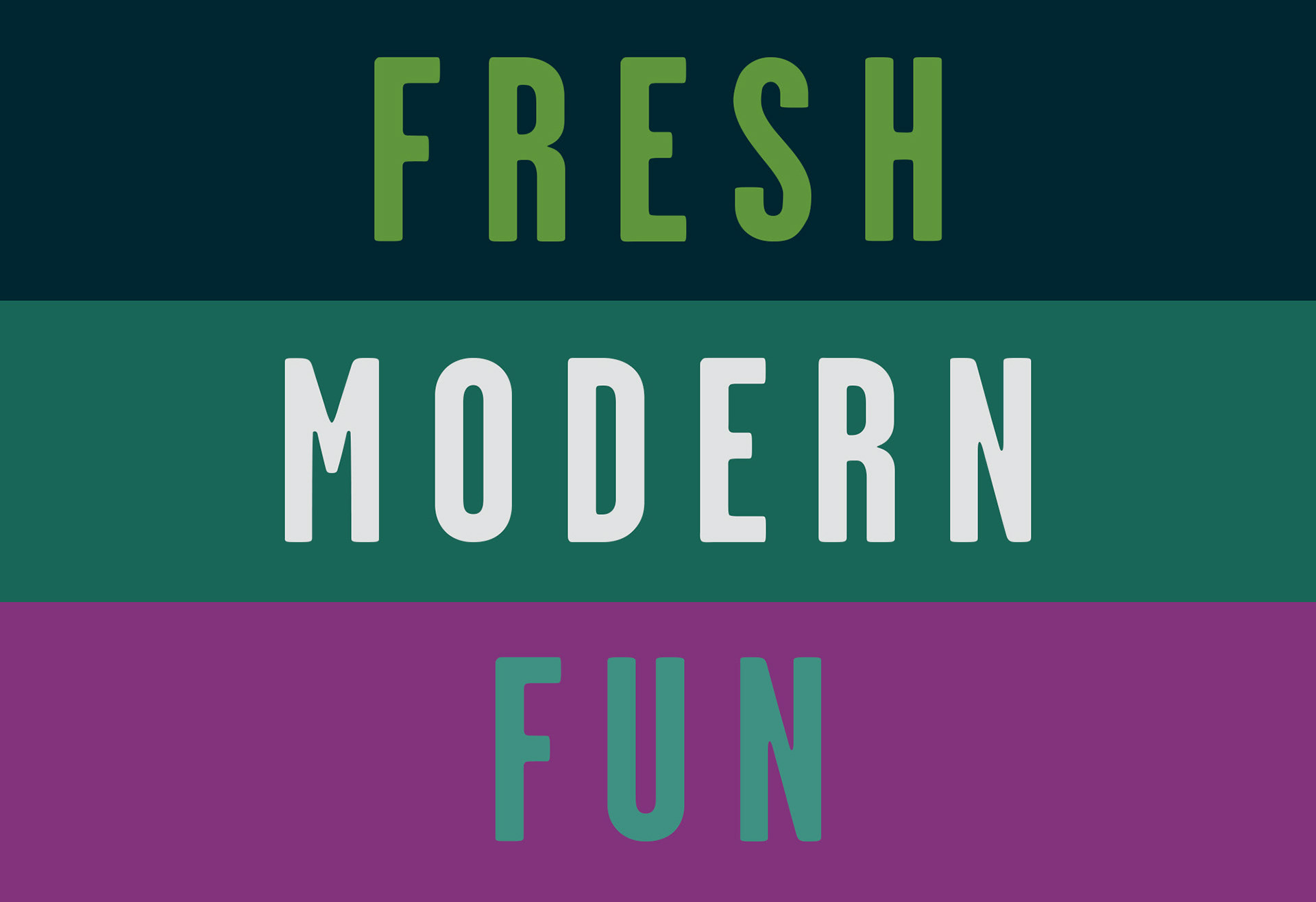
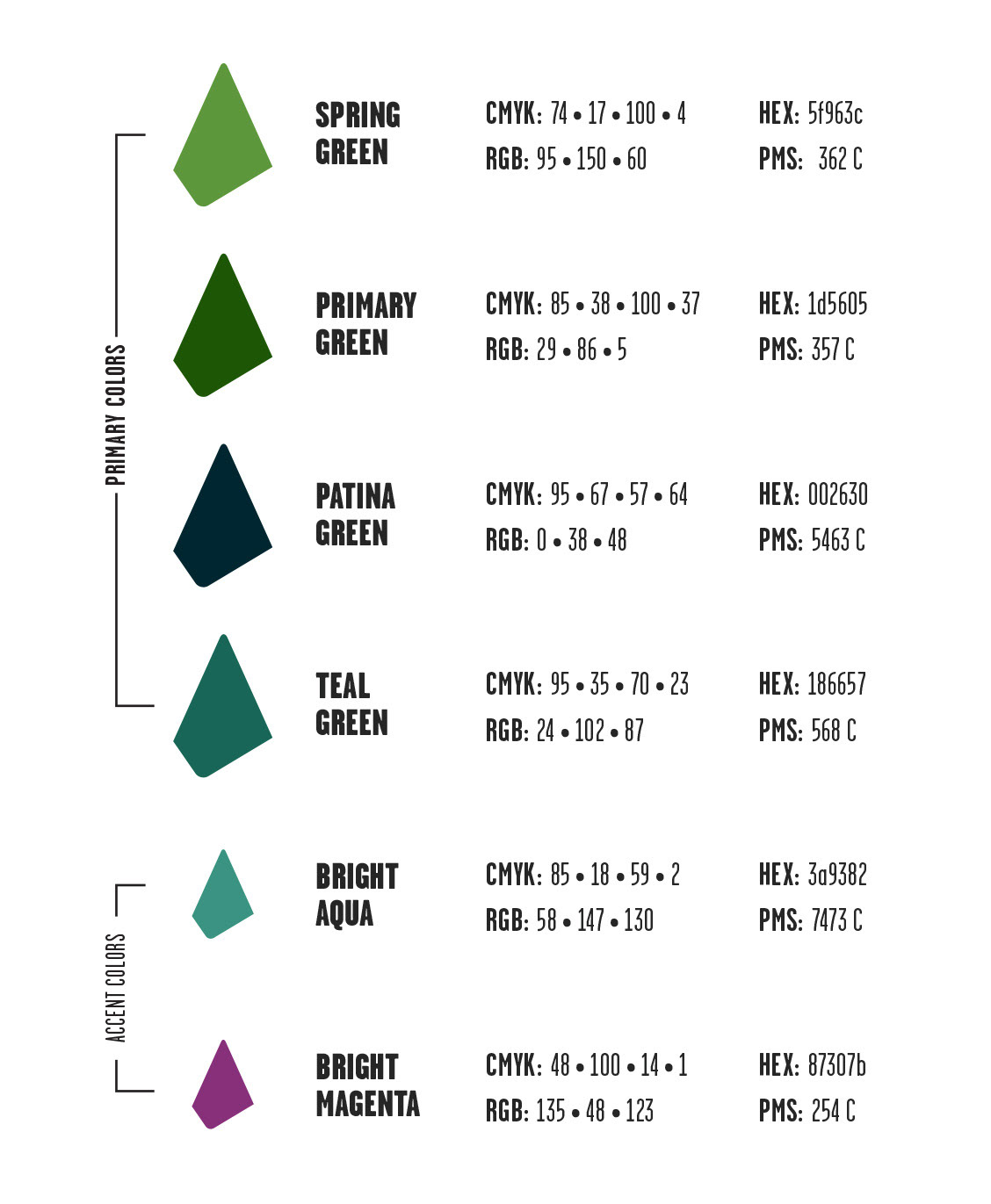
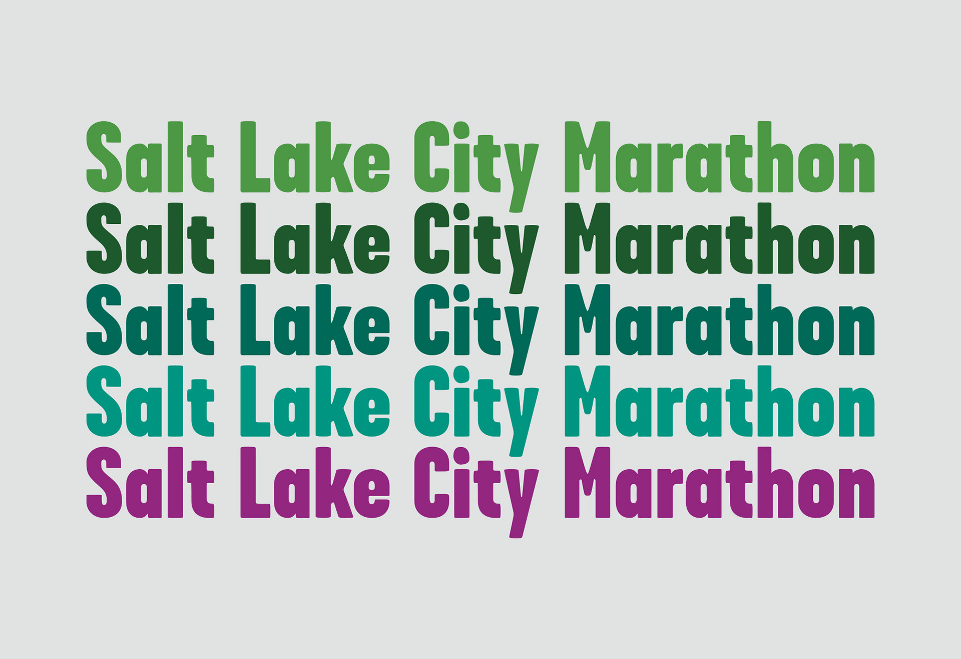
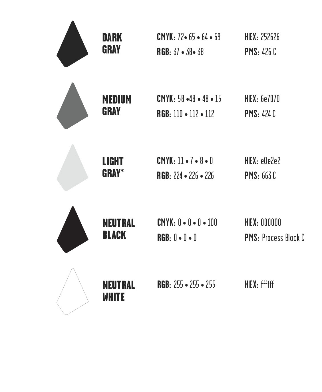
Color Palette Representations
The green hues represent the new life blooming in and around the city, which athletes will encounter along their race route. The darkest, blue-green hue represents the bronze patina of the city’s landmarks — like the Eagle Gate Monument — and the waters of the Great Salt Lake. The bright aqua and magenta accent colors bring excitement and energy to the color story. They are representative of the various blossoms in Temple Square juxtaposed by the beautiful skies that reflect in the windows of the surrounding cityscape.
